
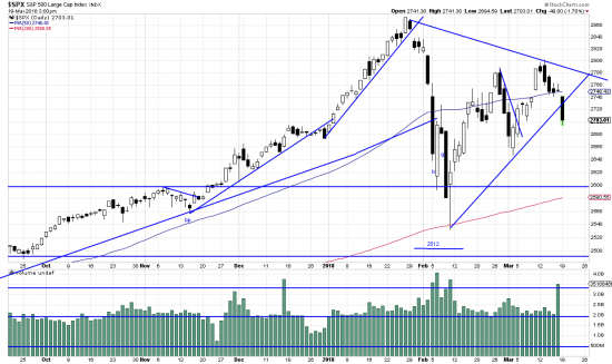
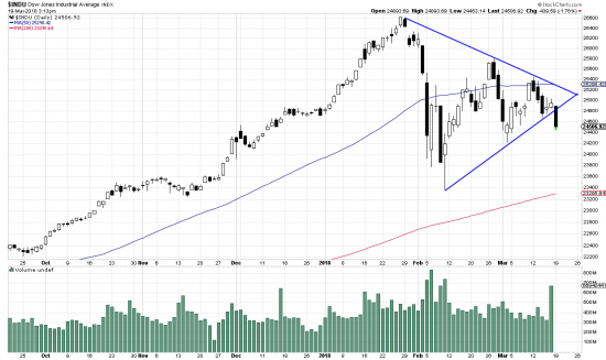
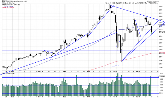
As we are in a very critical time in the life of this market we show two charts which should be (but may not be) complimentary. Prices are in a triangle (or breaking out of a triangle –on the downside. This is not good. The phenomenon is shown in the two major indices. The Dow chart is clear and only admits of one interpretation–a distinct downside breakout. The S&P chart is open to two interpretations, the one above and this one below:
Here the breakaway bar is considered to be part of the triangle– a discussable option.
Whatever, neither case is good news. Some of our colleagues believe that a change of character has occurred in the market. We are certainly entertaining that idea. (But it is not entertaining us much.) Leading to the conclusion that we are paring back our portfolio radically (we can always re-buy, but the market won’t give us back capital squandered in the meanwhile.) This market is now hostage to a capricious president with random economic ideas and no economic knowledge. The foreseeable future is volatility! volatility! volatility!