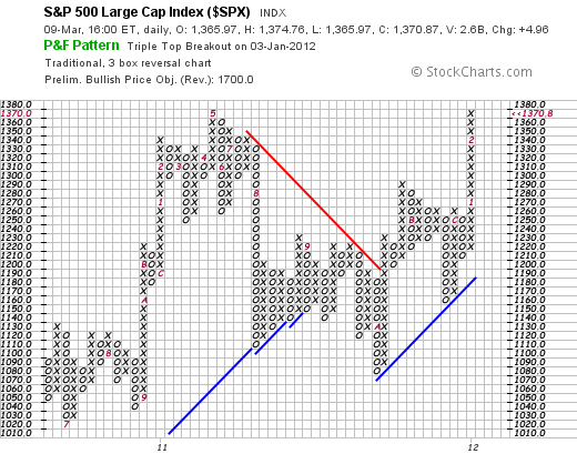
 Naturally no one can tell diddly from this map. Except the devotee of that arcane craft, point and figure (PnF) charting. Don’t let it warp your brain. Just note that the bullish price objective in the header is 1700. That’s a lot of SPX points. Enough to salve some of the wounds of the last few years. (An 2011 which finished the year less than 1 (one) SPX point from where it started.) And enough to make the fight worthwhile. If captured. By our estimation we are now into heavy trendfollowing territory.
This brings special joys for the trend following investor — namely heart stopping lurches as prices hit 10% (and sometimes worse) downdrafts. When we were managing commodity money we used to see these price “corrections” as ulcer making — not for our own money, but because the clients began to howl like dingos (do dingos howl?) (or perhaps coyotes) and the howling increased with each percentage of the downwave.
The market we are now in is the result of the 26 horizontal boxes (from the present line) multiplied by the box reversal size (3) multiplied by the box size (10). By Wyckoff measurements this gives us a target of 1860. More than the conventional measurement used by stockcharts.com (an excellent technical operation) in this PnF chart.
Are they serious the reader asks. We joke around a lot, and are fond of saying that we don’t stand behind our forecasts, but we stopped laughing when we read the February 13 Barron’s. Dow 15000. Dow 17000 in the next two years. We would have just kept laughing at Barron’s — but we keep shaking the crystal ball and running chart analyses and we keep getting numbers which agree with Barron’s — if not exceed it. Anyway we measure this thing, and we’ve tried a dozen, it looks like the promised land to us. As you will remember that was fatal to Moses. No prophets we, as our wife reminds us every morning. Or, alternatively, a prophet is not without honor, except in his own house.
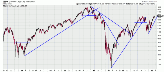
Barron’s got to its figure by doing a cycle analysis. This was based on the observation that periods of worse than average returns were followed by periods of better than average returns. Could be. (The average has to average out some way.) We love cycles but have never made a cent off them. We make money by taking signals and following the results with trend following systems which have low or non-existant failure rates. Here a chart of the last 10 years showing how simply simple trend lines captured the markets.
 Anyone who has read our letter since 1999 knows the effectiveness of this simple (simple-minded?) analysis. We watch with some amusement as our colleagues tear hell bent down the path seeking the philosopher’s stone in bands and oscillators and fibonnaci numbers and Gann lines and crop circles and solar flares and…. What a wondrous thing is man and his never ceasing search for the Holy Grail. Only geese are more dependable in their search for a better climate. Old readers, of course, know our sometimes repeated assertion that man is directly descended from geese.
Well, honk-honk. Get ready for this rocket ride and remember. If we’re wrong we just get stopped out unlike those geese who will meet their equity down in Key West (where Stevens and Frost got in a physical tussle over … poetry) and Hemingway got drunk on literature — or was it Cuban rum?

